How To Choose Patterns Which Complement Your Colouring

Just like your most flattering colours reflect your own colour characteristics, so it is true for patterns and prints. In order to choose patterns which complement your colouring, you need to be able to identify your key characteristics.

Choose Patterns Which Complement Your Own Contrast Levels and Intensity

For those with high contrast in their colouring such as Bright and Cool Winters, patterns which are bold and highly contrasted look wonderful. Patterns which combine bright, saturated hues such as hot pink and turquoise, emerald and violet, and true red and cobalt blue will look dynamic and startling. Geometric prints and abstracts are top of the list but highly stylised florals particularly on black backgrounds are also great.

High contrast patterns to complement high contrast colouring
Red and Blue
Geometric Patterns to complement high contrast colouring.
High contrast geometric pattern.

For those with low contrast and muted intensity like Soft Summers, and Soft and Muted autumns, monochromatic combinations create low contrast patterns. This means pairing slightly different shades of the same hue, such as a medium blue with a darker one. If you are fair with low contrast like some Soft Summers, stick with light to medium hues - pastels are perfect. If you are dark with low contrast, stay with darker monochromatic prints.

Monochromatic patterns to complement low contrast colouring.
Monochromatic shades of green.
Monochromatic pattern to complement low contrast colouring.
Monochromatic shades of red.

Mixing a neutral and a colour of similar value (depth) also creates low contrast.

Low contrast pattern mixing a neutral and a colour to harmonise with low contrast colouring.
Beige and Mustard

The important thing is to avoid patterns that incorporate colours from the opposite side of the colour wheel e.g. blue and orange.

Soft and muted colouring, will be flattered by patterns that can also be described as gentle and delicate, and having soft edges; think water colours and florals. The elements of the pattern should be small and disorganised. Choose autumnal colours if you are a Warm and blue-based colours if you are a Cool.

Soft floral to complement muted colouring.
Gentle floral in delicate colours.
Soft edged absract to complement muted colouring.
Soft edges and medium contrast

Avoid ordered geometric patterns in particular.

Choose Patterns Which Complement Your Value

If your value is light, as for Light Springs and Light Summers, patterns with deep, strong colours will overwhelm and overpower you. The former will sparkle in fun, busy and colourful patterns combining gelato tints of yellow, mauve, peach and/or aqua. The latter will shine in slightly more subdued blends of pastel pinks, blue, mauve and mint. Both look lovely in pretty florals and even soft edged geometric patterns.

A light fun floral to complement light colouring.
A light, fun floral.
Light, soft geometric patterns suit light colouring.
A pretty pastel geometric.

If you are one of the deeper seasons like Deep Autumn or Deep Winter, you will be underwhelmed and washed out by floral pastels and soft abstracts. Your best prints will match the strength of your colouring. Low contrasts will not be as wonderful as high contrasted patterns. Look for bold prints especially containing unusual and unexpected elements. Geometric patterns with round and angular shapes mixed together are perfect as are defined abstract prints. Combinations of pure colours from the opposite side of the colour wheel make great patterns for deep colouring while black backgrounds punctuated with pops of vivid colour are especially flattering on Deep Winters.

Bold pattern to complement deep colouring.
Dark background with pops of colour.
Complementary colour combinations flatter deep colouring.

And if you're not sure how to choose your patterns which complement your colouring because you are unsure of your key colour characteristics, consider having a colour analysis. It will take the guess work out of shopping, save you money and save you time. For more information click here. Colour Analysis - AbFab (abfabstyle.com)

Which greens are your most flattering if you are a Soft Dominant season? There is huge variation in the colour green, and that variety means there is definitely a green for all seasons. There are light greens, dark greens, bright greens, muted greens, yellow greens and blue greens. In my previous post I talked about the fact that everyone can look fabulous in green, but the question is with so many to choose from, which greens are your most flattering? To find the ones which will look loveliest on a Soft Dominant season, you must find a green that shares your temperature, intensity and value. This means you should choose greens of medium depth, have a muted intensity and ideally, have the same undertone as you.

Greens for the Soft Dominant Seasons: Intensity

This is the dominant or primary characteristic of these seasons. The greens which will look good on both of them will therefore have a muted or greyed down quality. Their best colours, green or otherwise range from very low to medium intensity. Neither season will be particularly flattered by clear and bright hues, these will actually overwhelm them. Instead, they look fabulous in softened, dusty, greyed down shades. And again, it is worth mentioning that a fabric’s surface affects intensity. Shiny surfaces like satin, lamé and sequins make colours brighter while matte fabrics such as chiffon, tulle and wool soften them. 

Greens for the Soft Dominant Seasons: Value

SOFT Warms and SOFT Cools have a very similar value profile. They both sit in the middle of the value spectrum meaning medium light to medium deep colours are their best. Very light colours, especially when worn alone will wash them out and very dark colours will be too heavy. Medium value greens include moss, khaki and mint.

Greens for the Soft Dominant Seasons: Temperature

This is the characteristic which truly differentiates the two soft seasons. SOFT Warms have a yellow-based undertone, SOFT Cools have a blue-based one. Remembering that green is a secondary colour made up of yellow and blue, those greens which have a higher percentage of yellow will be most flattering on Softs with a warm undertone, and those with a higher percentage of blue will complement Softs with a cool undertone.

So, which greens are your most flattering? Considering all three colour characteristics, the best choice for a SOFT Warm will be muted, medium light to medium deep yellow-greens.

Muted, medium, warm green.
Muted, medium, warm green

So, which greens are your most flattering? The best choice for a SOFT Cool, will be muted, medium light to medium deep, blue-greens.

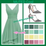
Mutged, medium cool green.

Medium, muted, cool green.

To conclude, take a look at the images below and you will see that both dresses are soft, medium light greens but one has obviously more yellow in it than the other. So, while both seasons could successfully wear either, it is still true to say that the warm green will be best on the Soft Warms and the cool green will be best on the SOFT Cools.

A perfect muted green for a SOFT Cool.
A perfect muted green for a SOFT Warm.

And if you are unsure what your dominant colour characteristic is, or you'd like to know more about colour analysis and what it entails, click here for more information. Colour Analysis - AbFab (abfabstyle.com)

COOL Clear (Cool Winter) and COOL Muted (Cool Summer)

Everyone can look fabulous in green, the trick is knowing which greens suit your season. There are a range of greens for all seasons! To find the ones which will look lovely on you, you must consider the three characteristics of all colours; temperature, intensity and value. When you share the same three characteristics as the green you're considering, you can be very confident that it will look fabulous on you.

Greens for the Cool Dominant Seasons: Temperature

By way of example, let's begin by focusing on the Cool Dominant categories: COOL Clear and COOL Muted. These two categories share a cool undertone or temperature as their dominant characteristic. The greens which will look good on them therefore have a COOL or blue undertone. They will both have several greens in common in their palette or swatch.

Greens for the Cool Dominant Seasons: Intensity

An important difference between the two Cool Dominant categories is intensity. COOL Clears look their absolute best in colours which have high to medium intensity meaning they are clear to slightly muted. So, blue- based greens which are clear to slightly muted will harmonise beautifully with them. COOL Muteds on the other hand, are best in slightly softer shades. Their best intensity ranges from low to medium high. They will look fabulous in softened, blue-based greens. And the greens these two categories have in common, as well as being blue-based, will be medium in intensity. It's worth mentioning here that a fabric's surface affects intensity. So, a factor to consider when choosing a garment is whether the fabric is shiny or matte. Highly reflective surfaces make colours appear clearer while matte ones soften colours. So, even when both seasons share the same greens, what can make the greens even more fabulous for each, is the surface of the fabric.

Greens for the Cool Dominant Seasons: Value

The third colour characteristic which determines whether a blue-based green suits a Cool Dominant is its value. COOL Clears can look wonderful in very light all the way through to very dark greens however, COOL Muteds look best in medium light through to medium deep greens. Bearing this in mind, the greens they have in common as well as being blue based and medium intensity will be medium depth; neither too light or too dark.

Cool Winters aka COOL Clears look fabulous in cool, deep, clear greens.

Cool Summers aka COOL Muteds look fabulous in cool, medium deep, soft greens.

We've all made the occasional sartorial mistake at some time or other. Many of us older girls can probably remember a few cringe worthy moments in our youth. So, in the interest of looking fabulous from here on in, ...here is one of AbFab’s ”don’t go there” tips; unco-ordinated colours.  For example, when you wear a pair of shoes in a fabulous colour but it  does not connect with any other part of your outfit, the shoes become an eye catching focal point. Sure it's great to have people admiring your shoes but not if the rest of you is completely overlooked. The result is not an harmonious and balanced visual image. Harmony and balance adds up to stylish in the fashion world. So, when adding colour to your outfit, aim for at least two points of connection, though three is preferable. Remember, nail polish and lipstick can each count. A little black dress worn with killer red heels, red nails and red nail polish would be spot on the money.  BTW this ‘rule’ doesn’t really apply to neutrals, we’re talking colours here. Check out our assessment of the two outfits here and see what you think. Because in the end it has to be said, if you like it, wear it!


There are many ways to look younger. From anti-wrinkle creams to cosmetic surgery, and all of them offer some hope in the quest to defy our aging appearance. Another consideration and a much less expensive option is finding out how Colour Consultants can make a difference to your appearance and how they can make you look younger.

Colour Consultants won’t deny that lots of things help give you a more youthful appearance. Skin care treatments, anti-aging creams, Botox, cosmetic surgery, a healthy diet, exercise, drinking lots of water and sleep all affect the way we look.

But most important of all is knowing and understanding what colours will make you look fabulous and what colours will make you look tired and sick. All sounds a bit mysterious? Well it isn’t really.

The impact of colour should never be underestimated. Colour consultants are able to inspire others to enjoy the benefits of perceptive colour selection. We admire and appreciate the existence of our colourful world.  We take pleasure from watching the colours of a setting sun. We are fascinated by the beauty of a rainbow or a field of spring flowers.

Many of us even have a basic understanding that colour is not only seen but felt. The whole experience of colour is influenced not only by light energy that enters the eye from our surroundings, but also by subjective factors from within the brain. So is it any wonder we can even have positive or negative reactions to colour. For example the colour red can evoke feelings of excitement or threat. Yellow can be associated with cheerfulness or apathy and purple can relate to Royalty or depression. These are just to name a few as there can be almost as many reactions and responses as there are actual hues.

So why does colour have such a profound effect on our appearance? Colour is reflective , and when worn near the face reflects up onto the skin, hair and eyes. When a colour is worn that is in harmony with a personal natural colouring, that person will appear healthier, brighter, more youthful and alive.  The human eye responds positively to harmony and balance. It is aesthetically pleasing when colours relate to each other in some orderly logical way. In fact wearing the wrong colours can give the wearer the appearance of being older, unwell, and tired. So don’t reach for the expensive face creams or sign up for the Botox just yet.  Simply find out what colours look great on you.

Colour Consultants can make us look younger because they have an understanding of certain areas of our colouring that are important and should be considered in combination. That is skin, natural hair colour and eye colour and intensity. We all have the elements that make up our colouring in varying amounts, i.e. hemoglobin, carotene and melanin.

Because the human eye responds positively to harmony and balance and it is aesthetically pleasing when colours relate to each other, it is logical then that the information from Colour consultants would be of huge benefit in the quest to look younger.

It may be a little over the top to suggest that colour consultants can change your life, however, they can change your visual image, the way you shop and your wardrobe. A personal Colour Analysis by a qualified Colour Consultant can be highly informative and enlightening. The consultant will increase your awareness and appreciation of colour and how it impacts on you. In many instances she will confirm what you already know; she may articulate what you have sensed to be true about your own colouring and the colours that attract you.

Colour Consultants can explain the three qualities of colour; temperature, intensity and depth.

The temperature of a colour refers to the presence of yellow (warm) or its absence (cool). The intensity refers to a colour’s light reflecting properties; highly reflective colour is bright while matte shades are muted. The depth of a colour is the most obvious trait to observe.

The colours that will best suit you are those colours that share the same qualities that you possess. For example if your overall depth of colour is medium, then you will be best suited to colours that are of medium depth. If the intensity of your colouring is muted, then you will be flattered by colours that are muted, softened or toned down. The fairer you are the more disconnected and unbalanced you will appear when very deep colours are placed below your face. Conversely, when someone with very strong and deep colouring wears pale colours they will appear drained by these shades. A colour consultant explains and demonstrates the quality of colour by a visual assessment of her client and the draping process. This allows you to see the impact of colours and their varying characteristics on you.

The knowledge and understanding that you acquire from a colour consultant will effect some very positive changes in your appearance, shopping habits and wardrobe organisation. When you embrace the colours that harmonise and balance your own colouring you will appear healthier, younger and more vital. Your skin tone will be more radiant and your complexion more even. Minor imperfections recede and the colour of your eyes and hair will be intensified.

You will find colour to be a great starting point when you hit the shops. A quick scan of the racks in your favourite boutique or department store will reveal whether there’s the likelihood of finding something fabulous. If the colours are not for you, there is no point in looking at the styles. …Move on!

Back in the wardrobe at home, use colour as your way of organising and arranging your garments. Keep your neutral coloured items together and then group similar coloured garments together. Its great when all your black camis and tops are in the one drawer and not spread throughout your cupboard. When colour is the system you are working with, your clothes will remain in a logical and accessible order. This great strategy will serve you well on those mornings when the alarm doesn’t go off, the cat has disappeared and you’ve burnt the toast.!!!

So, will a Colour Consultation change your life? That’s still debatable, however what is absolutely certain, is that she will impact your life in a very positive way.

Colour is one of the key elements that determine whether clothes will flatter or detract from us. Generally we are attracted to the quality of colour that harmonises, balances and complements our own colouring. However, fashion, friend’s advice, availability, budget constraints and a lack of time all conspire against us; we ignore our own innate good sense. So how do we overcome this problem? With the help of a colour consultant

Colour consultants can save you a fortune!

Most of us will plead guilty to wearing the same garments time and time again, while dozens of outfits are stuffed in our wardrobes and drawers rarely seeing the light of day. Our favourite clothes are often neutrals such as black and grey. Without a sound understanding of the qualities of colour and in particular the qualities that suit us, we shop in a random and ad hoc manner. Our wardrobes are full of stand alone items rather than clothes that effortlessly and seamlessly co-ordinate.

One of the great benefits of having a colour analysis is that you learn how to develop an integrated wardrobe of clothes. When you begin to only buy garments that are in your best colours you create a wardrobe of items that mix and match. Virtually all your tops can be worn with all your pants, skirts and jackets. Your shoes and accessories can also be worn with many garments rather than a few. This greatly expands your options and provides you with a wonderful array of possible outfits for a much smaller financial outlay.

Colour consultants can raise your self esteem.

When you are shown how flattering your best colours are for you, it’s hard not to feel good about yourself. Your best colours make your skin appear radiant, healthy and youthful. They bring out the highlights in your hair and the colour of your eyes. They make you the star rather than what you are wearing.

Colour consultants can increase your confidence levels.

You will become much more confident about shopping and dressing. The more you learn:

  • how to look fabulous, easily
  • how to shop, discerningly
  • how to resist fads, firmly
  • how to co-ordinate, effectively,

the more your self confidence will soar.

Colour consultants can open your eyes to a world of colour choices.

Many people suffer from the misconception that a Colour Analysis offers you a small range of colours and is thereby limiting and restrictive; quite the contrary. You will learn how to combine colours in different and innovative ways, only limited by your imagination. Your options are exciting.

Colour Consultants can educate you.

You will be shown how to work with textures, fabric surfaces, patterns and contrast levels. The choices you make with these elements are as important as colour itself.

We each have our own textural quality and contrast levels.  When we understand these things about ourselves we can understand why we are drawn to certain patterns and fabrics.

With understanding comes order and organisation. Our shopping becomes systematic and sensible. Our wardrobes become functional and effective. We become masters of our own image rather than slaves of fashion trends.

A Colour Consultant is a skilled colour analyst who is able to inspire others to enjoy the benefits of perceptive colour selection. They are able to demonstrate how and why some colours enhance a person’s appearance, giving them a look of health, youth and vitality, while other colours detract, leaving the wearer looking tired, old and ill.


Colour Consultants can also be regarded as being part of a helping profession. Many women seek the advice of a Colour Consultant at times of great change in their lives. It may be a divorce, illness or loss of a job. The aim of our service and consultations is to empower our clients, make them feel stronger and more confident in themselves, to look good and feel great.

During your Colour Consultation you will find out:

  • Your basic undertone (Cool or Warm
  • Your major season (Winter or Summer/ Spring or Autumn
  • Your Flow (Deep, Light, Cool, Warm, Clear or Soft
  • Your required contrast levels for clothes and hair colour
  • Which fabrics best suit you
  • Which fabric characteristics suit you
  • What types of patterns suit you best
  • Your hair colour and eye colour options
  • How to use your colour swatch
  • Discover the link between your personality and your colouring
  • Your face shape to help you select hats , eyewear, hairstyles and earrings etc·
  • Make-up recommendations

A  Colour consultant will determine what colours are best for an individual by looking at the following areas:

  • Skin tone
  • Natural hair colour
  • Eye colour and intensity
  • Clarity
  • Facial Characteristics
  • Personality

Your colour consultation takes approximately 90 minutes. By the end of this you will have an understanding and have visually witnessed what colours look great on you. You will also be presented with a swatch which is a wheel of 50 plus colours. How you wear and combine these colours  are only limited by your imagination. It is advised to have faith in this swatch because when you purchase items of clothing worn close to the face in your “right colours” they will have an absolutely positive impact on your face. This also applies to your accessories, i.e earrings, necklaces and scarves, and make-up.

It’s one thing to be given this beautiful swatch of colours but now you have to learn how to apply it to the clothes in your wardrobe and to all the clothing and make-up purchases you will make in the future.

It may take up to five years of conscious effort to develop a wardrobe that is colour correct and coordinated so take it one step at a time. If you have a wardrobe full of the wrong colours , make each new purchase a right one and before too long it will all come together.  Your colour consultation will not only discover your true fabulous colours but you will be able to shop smart and effectively with a mistake ratio of zero. Ultimately ending up with a wardrobe full of favourites and 100% effective instead of wearing 20% of your wardrobe 80% of the time.