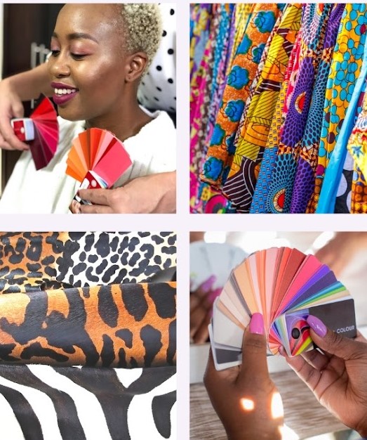
Just like your most flattering colours reflect your own colour characteristics, so it is true for patterns and prints. In order to choose patterns which complement your colouring, you need to be able to identify your key characteristics.
Choose Patterns Which Complement Your Own Contrast Levels and Intensity
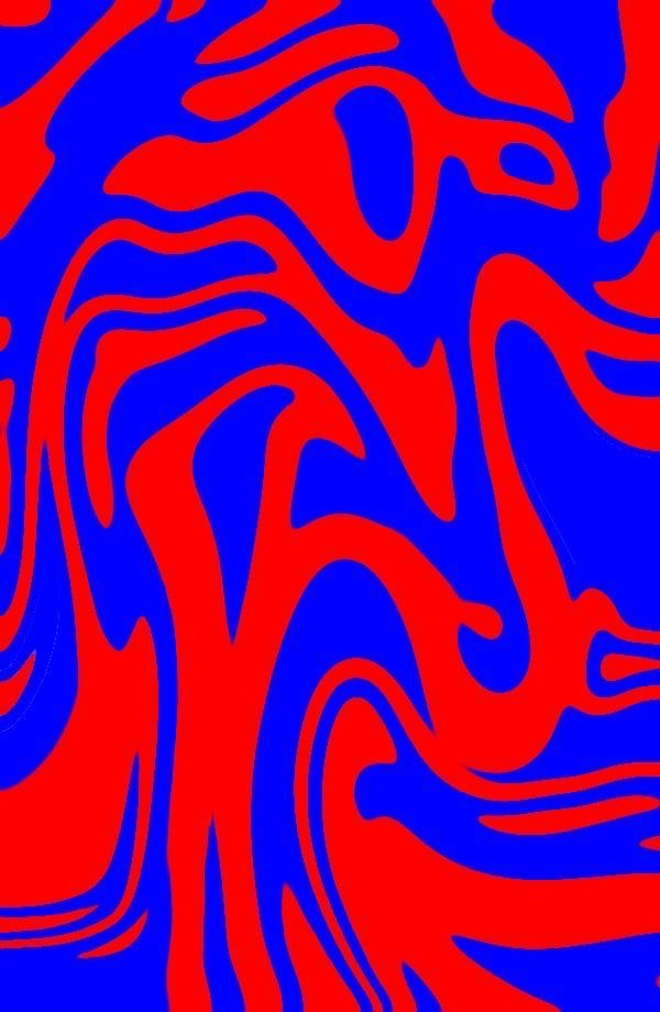
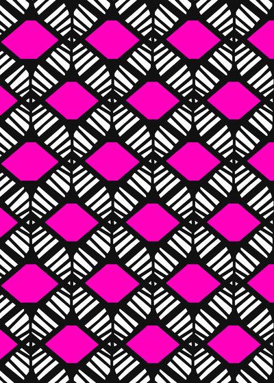
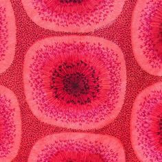
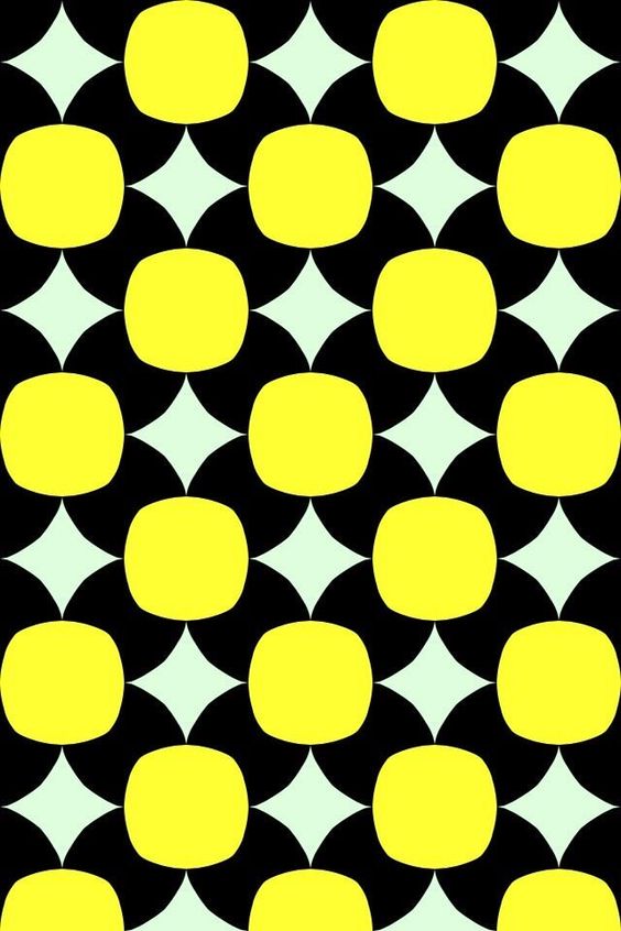
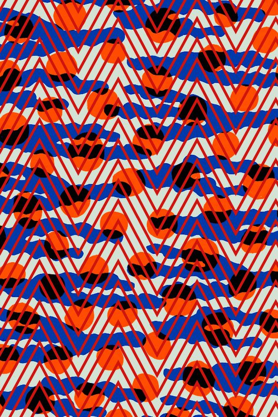
For those with high contrast in their colouring such as Bright and Cool Winters, patterns which are bold and highly contrasted look wonderful. Patterns which combine bright, saturated hues such as hot pink and turquoise, emerald and violet, and true red and cobalt blue will look dynamic and startling. Geometric prints and abstracts are top of the list but highly stylised florals particularly on black backgrounds are also great.
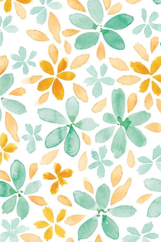
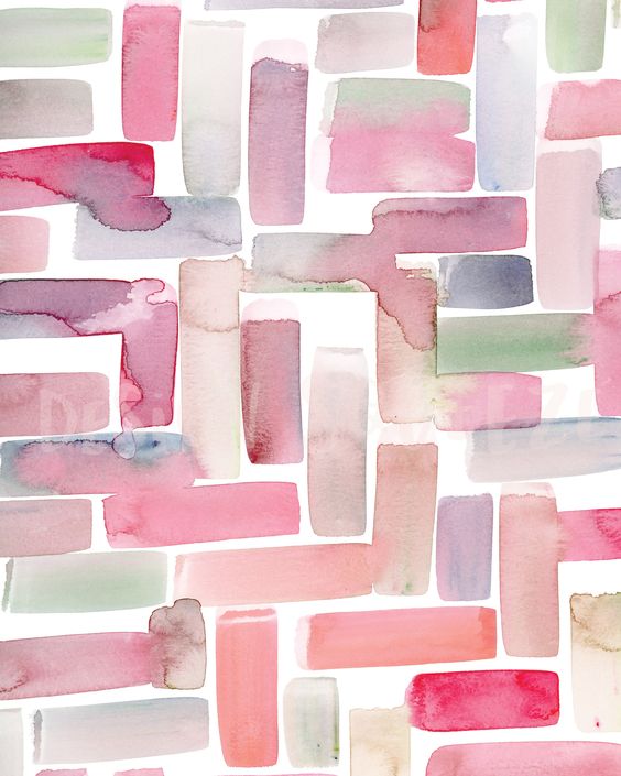
For those with low contrast and muted intensity like Soft Summers, and Soft and Muted autumns, monochromatic combinations create low contrast patterns. This means pairing slightly different shades of the same hue, such as a medium blue with a darker one. If you are fair with low contrast like some Soft Summers, stick with light to medium hues – pastels are perfect. If you are dark with low contrast, stay with darker monochromatic prints.
Mixing a neutral and a colour of similar value (depth) also creates low contrast.
The important thing is to avoid patterns that incorporate colours from the opposite side of the colour wheel e.g. blue and orange.
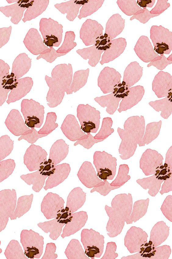
Soft and muted colouring, will be flattered by patterns that can also be described as gentle and delicate, and having soft edges; think water colours and florals. The elements of the pattern should be small and disorganised. Choose autumnal colours if you are a Warm and blue-based colours if you are a Cool.
Avoid ordered geometric patterns in particular.
Choose Patterns Which Complement Your Value
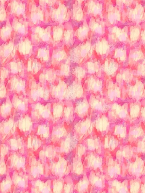
If your value is light, as for Light Springs and Light Summers, patterns with deep, strong colours will overwhelm and overpower you. The former will sparkle in fun, busy and colourful patterns combining gelato tints of yellow, mauve, peach and/or aqua. The latter will shine in slightly more subdued blends of pastel pinks, blue, mauve and mint. Both look lovely in pretty florals and even soft edged geometric patterns.
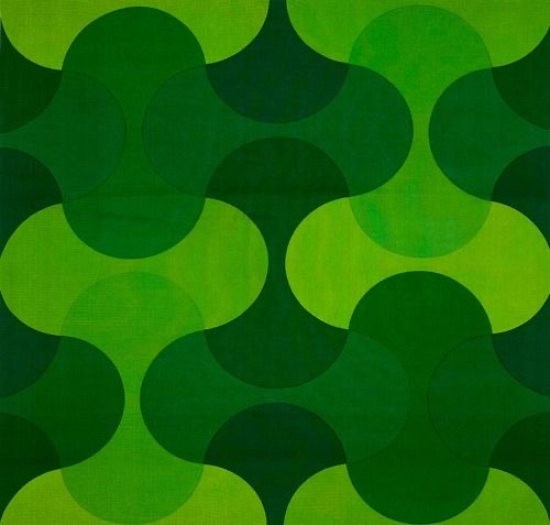
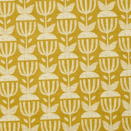
If you are one of the deeper seasons like Deep Autumn or Deep Winter, you will be underwhelmed and washed out by floral pastels and soft abstracts. Your best prints will match the strength of your colouring. Low contrasts will not be as wonderful as high contrasted patterns. Look for bold prints especially containing unusual and unexpected elements. Geometric patterns with round and angular shapes mixed together are perfect as are defined abstract prints. Combinations of pure colours from the opposite side of the colour wheel make great patterns for deep colouring while black backgrounds punctuated with pops of vivid colour are especially flattering on Deep Winters.
And if you’re not sure how to choose your patterns which complement your colouring because you are unsure of your key colour characteristics, consider having a colour analysis. It will take the guess work out of shopping, save you money and save you time. For more information click here. Colour Analysis – AbFab (abfabstyle.com)


Comments are closed.