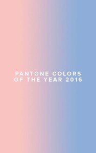
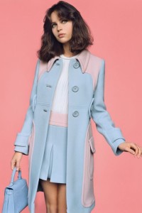
Every year the Pantone Colour Institute selects a shade that they pronounce to be the colour of the year. This year, for the first time ever, they announced not one colour but two. Or more correctly, a combination of two colours; Rose Quartz and Serenity. It is an exquisite pairing of two beautiful pastel shades of pink and blue.
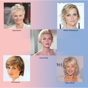
However, as gorgeous as this colour combination may be, like everything in fashion, it will not look absolutely fabulous on everyone. I love these colours, they are truly gorgeous but I know they will do little for me with my deep, high contrast colouring. So, who will this combination suit? Pantone’s choice for this year is a match made in heaven for women with cool, light and medium contrast colouring. If you have blonde, grey or light brown hair, fair skin and your eyes are green, blue, grey or light brown then you are going to look stunning in Pantone’s choice for 2016.
However, it is not just about your colouring. The other important consideration is your Style Personality.
The emotions these colours evoke and the impression they create may not fit with your personality or visual image. If you know you have an element of romantic femininity to your style, then you will probably love these colours. If you shun most things delicate, girly and pretty then you will probably shun Rose Quartz and Serenity too. That ‘s not to say however, that women who prefer a more natural/relaxed style or classic/elegant style can’t embrace these shades. And while the whole pink and blue catastrophe may be too much for everyone, scarves, earrings, shoes and make-up are all ways of incorporating an ‘on-trend’ element to your outfit.
Check out the celebrities, past and present who would look fabulous wearing Rose Quartz and Serenity.
